"A significant part of the search terms leading to the publishing house's website includes, in fact, expressions such as: 'livros salesianos', 'editora salesianos' and 'catecismos salesianos'. In this sense, we believe that this change will be well received by the market," explained the Lisbon-based Salesians.
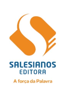
The change in the name of the publishing house is also accompanied by a change in the logotype and the presence of an accompanying payoff that reads "A força da palavra" (The power of the word).
At the graphic level, the new design represents a book seen from above, the front cut of which forms the letter E, in a clear reference to the word "Editora." This element is then crossed by a strip in the shape of an S (for "Salesianos"), representing an open path that provides for different levels of reading:
- the connection between the publisher and the reader, which is embodied in the book,
- the connection between the higher (God) and the world (the readers).
The brand colors of the Salesian publishing house, orange and blue, have been retained and are the connecting element between the two graphic representations of the Salesian publishing house of Portugal, and for a certain period of time will naturally be brought to coexist.
The motto - "The Power of the Word" - sums up the publishing house’s mission: to spread, through the printed word, the transforming power that the Word of God infuses into the reader's life.
The change of name and the institutional image will be immediate in the issuance of billing documents, but gradual in what concerns printed products and graphic representations of "Salesianos Editora" bookstores present in Porto, Lisbon, and Évora.


